

May '25 - Jun' 25
How we revamped Rapido's pickup experience
UX Journey
Framework Building
UX Journey
-10.27%
Reduction in cacellations
+8.61%
Increase in pickup accuracy

The Problem That Wasn't Supposed to Be a Problem
At Rapido, pickup is make-or-break. It's those critical 2-3 minutes where a user and captain try to find each other in the chaos of real streets, real traffic, and real confusion. When pickup fails, the entire ride collapses before it even begins.
We knew pickup was broken. Cancellation data showed users were abandoning rides, but the why wasn't immediately clear. Was it a navigation issue? A communication gap? Environmental factors?
Rather than commit to one big redesign based on assumptions, I chose to run three small, targeted experiments. Each would test a different hypothesis about what was actually breaking during pickup. The plan was simple: whichever experiment won, we'd scale it into the product.
Then all three experiments worked.

Why I Chose not to go ahead with a Full Redesign
I could have started with a comprehensive redesign of the entire pickup experience. But here's why I didn't:
The risk was too high. Pickup happens millions of times daily across Rapido. A failed redesign wouldn't just be embarrassing, it would directly impact revenue and user trust. Small experiments gave us the ability to fail safely and learn quickly.
We didn't actually know the root cause. Our analytics showed that pickup was failing, but not why. User interviews revealed wildly different pain points: some users didn't realize they needed to walk, others couldn't read the map, and some were lost despite being at the right spot. Testing multiple hypotheses in parallel helped us understand which problems were most critical.
Speed mattered. Three lightweight experiments could run simultaneously in different markets within two weeks. A full redesign would take months and still might miss the mark.
The Three Experiments (And Why Each One Worked)
Experiment 1: Walking Guidance
The hypothesis: Users don't realize they need to walk to their pickup point.
I added a simple nudge: "Start walking towards your pickup point" with a directional indicator. No fancy animations, no complex UI—just clear instruction at the moment of booking.
Why this worked: Post-experiment interviews revealed that many users assumed the captain would come to wherever they were standing. They didn't understand that pickup points are algorithmically optimized for traffic flow, not for user laziness. The nudge created intentional movement, reducing the distance captains had to search.
The invisible detail: The nudge appeared only when the user was more than 50 meters from the pickup point. Closer than that, it would feel patronizing. This threshold was calibrated using movement data from successful pickups—we found that users within 50m naturally gravitated to the right spot.
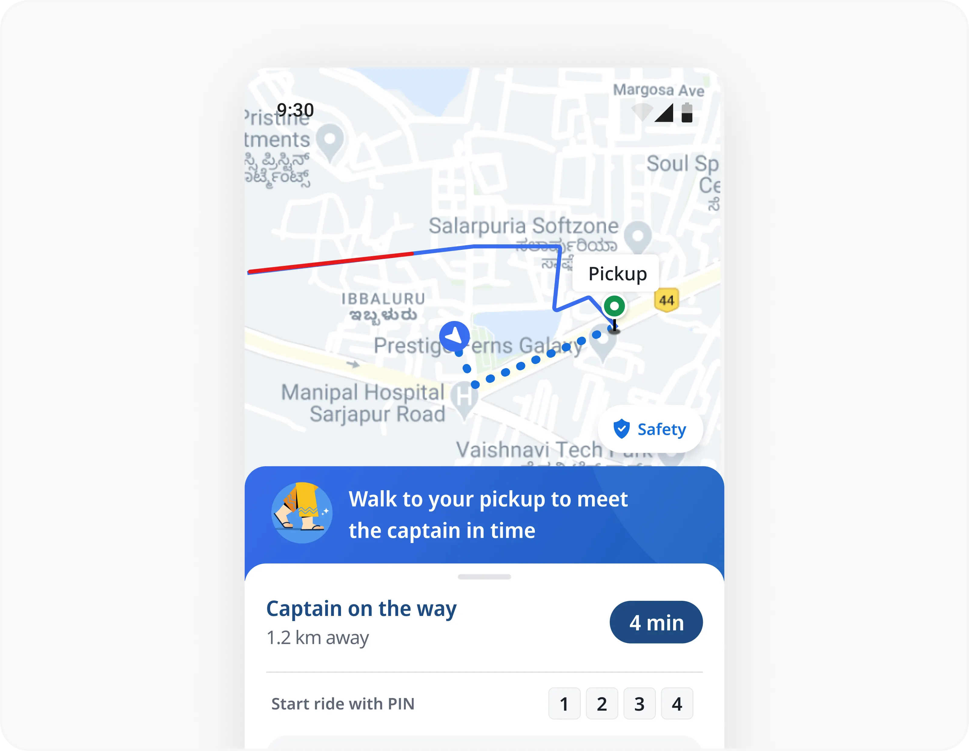
Walking Guidance Experiment
Experiment 2: 3D Pickup View
The hypothesis: Users can't orient themselves using a flat, top-down map.
We tilted the default map view into a 3D perspective, showing buildings and landmarks from an angled viewpoint. Users could now see from which direction their captain was approaching.
Why this worked: Heatmap data showed users were constantly rotating and zooming the map, trying to match it to their real-world surroundings. The 3D view did that cognitive work for them. They stopped fighting the map and started using it.
The invisible detail: The camera angle wasn't arbitrary—it was calibrated to 45 degrees with a slight northeast bias. This angle maximized landmark visibility while keeping the captain's icon and route clearly visible. We tested 30°, 45°, and 60° angles; 45° had the highest comprehension rate in user testing.
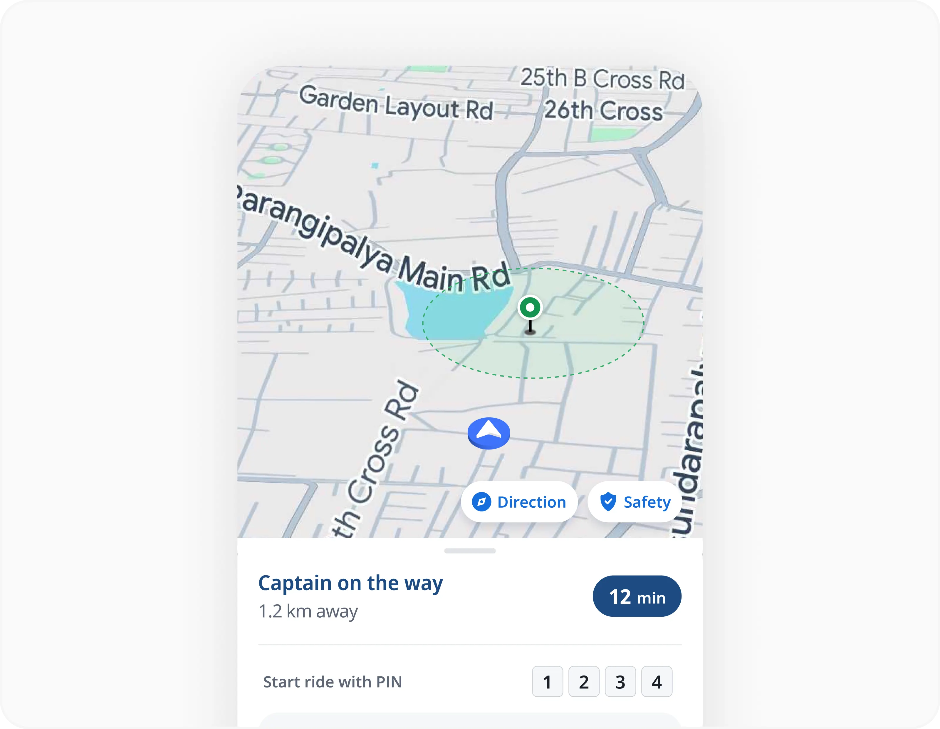
3D Pickup View Experiment
Experiment 3: Street View Integration
The hypothesis: Users need a first-person perspective to confirm they're at the right spot. We embedded Google Street View directly into the pickup screen, triggered when the user was near the pickup point. Users could now see exactly what the pickup location looked like—down to the storefront, signage, and street furniture.
Why this worked: Users weren't just lost—they were uncertain. Even when standing at the pickup point, they'd second-guess themselves. "Is this really it?" Street View eliminated that doubt. It gave them visual confirmation that yes, you're in the right place, just wait here.
The invisible detail: Street View appeared only when the user was within 100 meters of the pickup point and moving slowly (< 2 km/h). If they were still walking briskly, they didn't need confirmation yet, they needed navigation. The trigger was based on both proximity and velocity, which prevented premature activation.
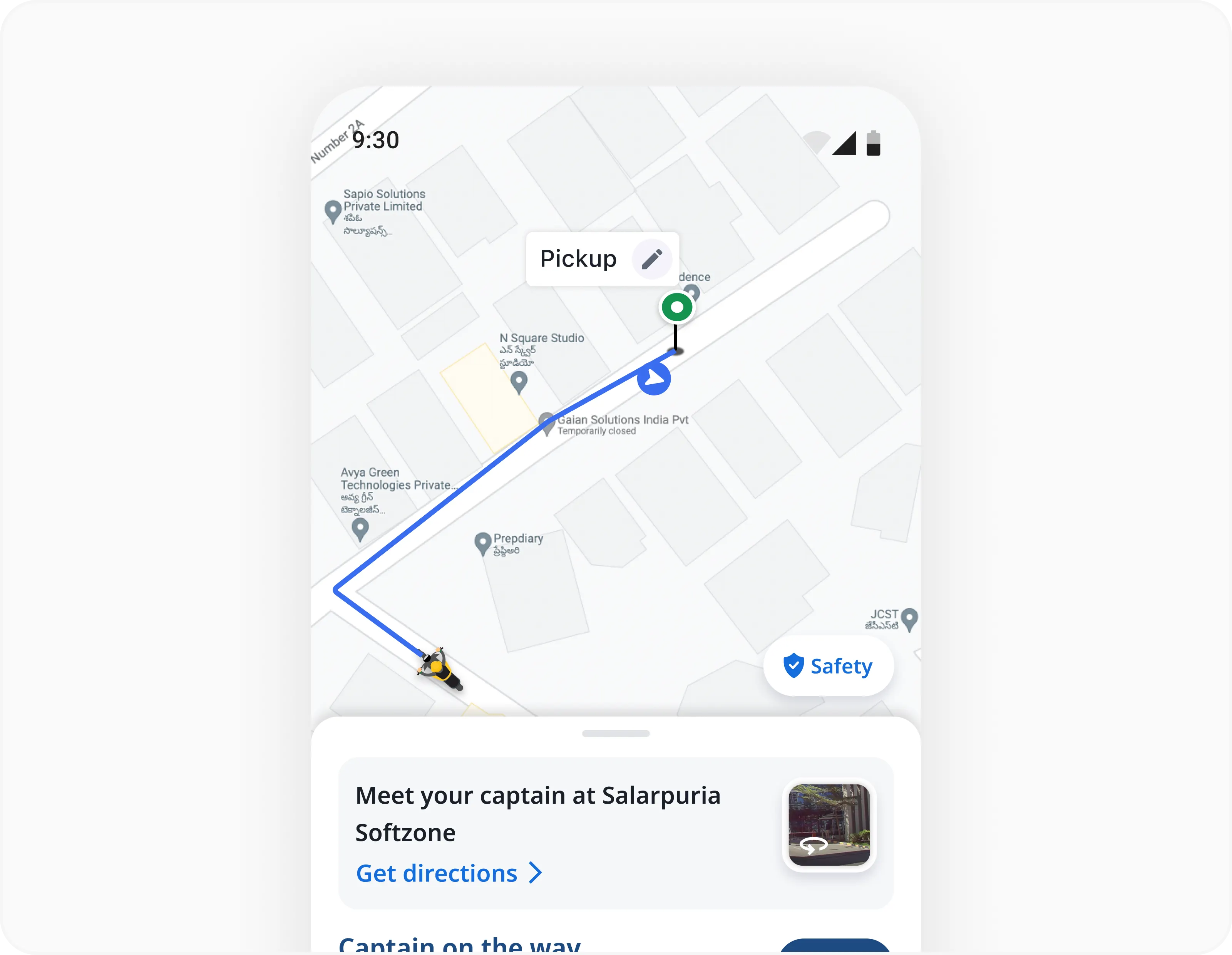
Street View Experiment
When Success Creates Chaos
Here's what no one tells you about experiments: sometimes they all work, and that's worse than all of them failing.
We now had three validated solutions, each addressing a real user need. But implementing all three at once would create a fragmented, overwhelming experience. Users would be hit with walking nudges, 3D maps, and Street View overlays all at once. It would feel like we were shouting at them from three different directions.
The challenge wasn't "which experiment won?" It was "how do we make these work together without creating cognitive overload?"
The Failed First Attempt: My initial approach was to layer all three features into the existing post-order screen. Walking guidance at the top, 3D map in the middle, Street View as a swipeable card at the bottom.
It was a disaster.

The 1st concept
In internal testing, even our own team members were confused. The screen felt cluttered and competitive, each feature fighting for attention. Users didn't know where to look or what to prioritize.
The trade-off I made: Instead of showing everything at once, I needed to show the right thing at the right time. This meant the UI would need to be context-aware, adapting dynamically based on where the user and captain were in the journey.
But this created a new constraint: technical complexity. Our existing post-order screen was a static layout. Making it dynamic would require rewriting significant chunks of the codebase, and our engineering timeline was tight.
I had two options:
Push for a full rebuild (~2 months)
Work within the existing architecture and use conditional logic to swap components
I chose option 2. We could trigger different UI states without a full rewrite by using geofencing and real-time location data we already had. It wasn't the perfect solution, but it was shippable within 4 weeks.
Deconstructing the Post-Order Screen
Before designing anything, I needed to understand when each piece of information actually mattered.
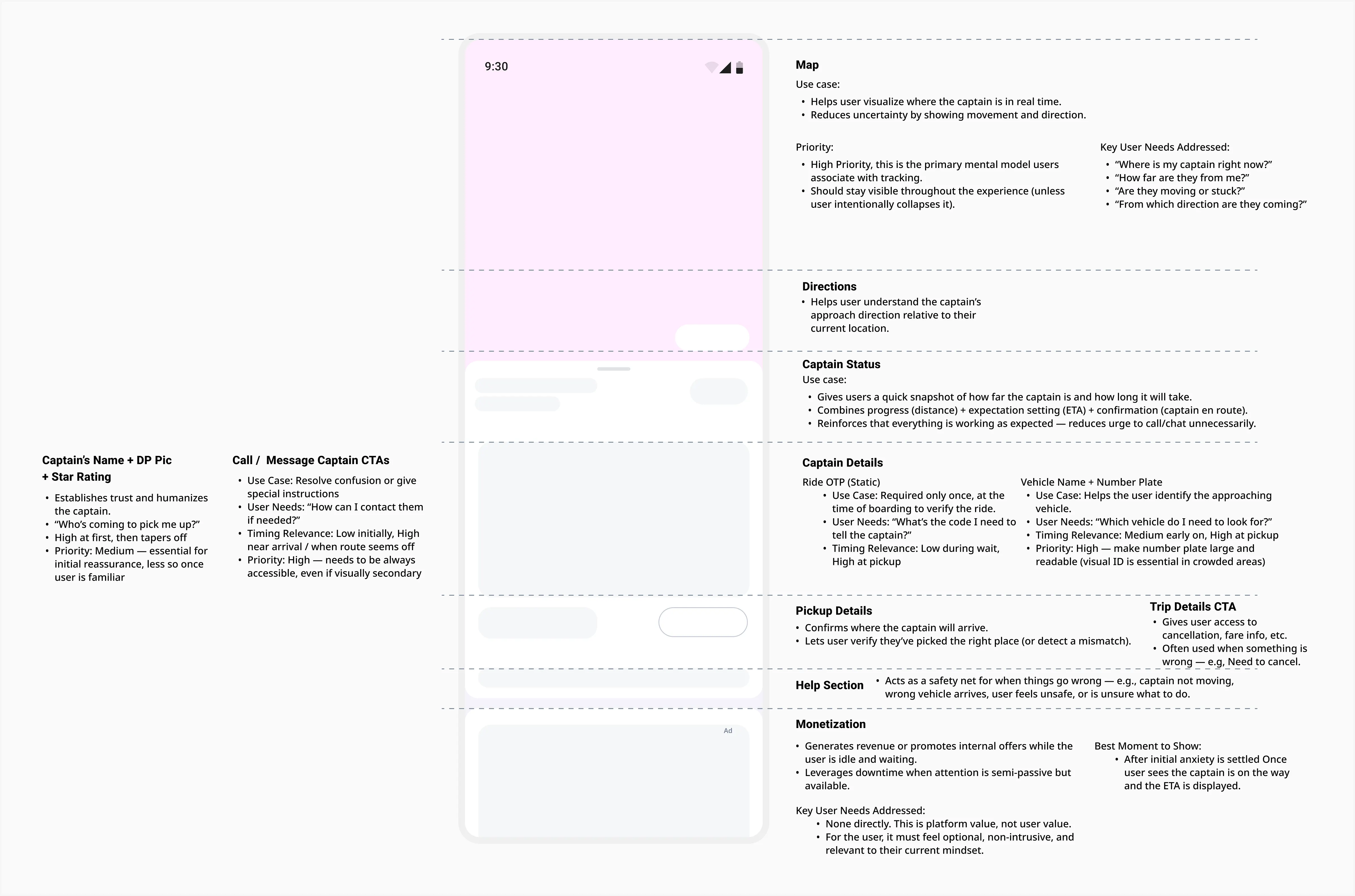
Post Order Screen Breakdown
I started by analyzing the post-order screen, the core surface of the entire pickup experience. This screen contains everything: pickup status, captain ETA, map view, vehicle details, contact options, pickup location, and more. The question was simple: what information does the user actually need at each stage?
I listed out every element visible on this screen and created a framework to prioritize them. Which pieces of information should be prominent when the captain is far away? Which should fade into the background? What needs to surface when both parties are close but can't find each other?
The Moment Everything Clicked
During this exercise, I had a realization that became our guiding principle:

The existing post-order screen treated every piece of information equally. ETA, vehicle details, captain photo, map, contact buttons—all competing for attention simultaneously. Users were paralyzed by choice, not empowered by it.
This insight fundamentally shifted our approach. Instead of asking "what should we add to help users?" we started asking "what can we remove at each moment?" The goal wasn't to display more information, it was to display the right information at the right time, and ruthlessly suppress everything else.
This framework wasn't based on assumptions, it was grounded in user behavior patterns we saw in the data. By mapping information priority across different moments in the journey, we could see exactly what to highlight and what to suppress as the situation evolved.
From this exercise, four distinct scenarios emerged
When both the user and the captain are away from the pickup point
When the user is at pickup, but the captain is still away
When the user is away, but the captain has arrived
When both the user and the captain are at pickup
These four scenarios became the skeleton of our design system. Each one represented a fundamentally different user need, and therefore required a different information hierarchy.
But I couldn't stop at the framework level. I needed to validate whether our prioritization actually matched what users experienced in the real world.
So I went on-ground. I stood on street corners in Bangalore, Hyderabad, and Delhi, watching users struggle through pickup. I interviewed them in real-time: "Right now, at this exact moment, what are you trying to figure out?"
What I Learned:
Scenario 1: Both user and captain are far from pickup
Users care about ETA and distance, not vehicle details or captain photo
They're anxious about when to start walking, not how to walk
Showing too much information here creates analysis paralysis
Scenario 2: User at pickup, captain still away
Users are uncertain if they're at the right spot
They instinctively look around for visual confirmation
Street View becomes critical here, not earlier
Scenario 3: User away, captain at pickup
Urgency is everything, users need to know they're keeping someone waiting
The wait timer (which already existed) wasn't prominent enough
A small visual change, highlighting the timer in orange, created immediate action
Scenario 4: Both at pickup, but can't see each other
Users are frustrated and scanning the street
They need to orient: "Which direction is the captain coming from?"
3D pickup view becomes essential here, not earlier
The Insight:
Information isn't universally important, it's contextually important. The key wasn't to show everything; it was to show the right thing at the right moment.
A Trigger-Based, Scenario-Aware Flow was born
Armed with real-world insights, I redesigned the post-order screen to adapt dynamically based on four distinct scenarios.
Scenario 1: Both User & Captain Away
Design decision: Surface walking guidance and focus the screen on captain ETA.
Why: If the user doesn't start moving, the pickup is already compromised. Everything else, vehicle details, captain photo, is noise. I stripped the screen down to two elements: "Start walking" and "Captain is X minutes away."
The invisible detail: The walking guidance wasn't just text. It included a subtle directional arrow that updated in real-time as the user moved. This wasn't about hand-holding; it was about building momentum. Small movement = psychological commitment to the ride.

Scenario 2: User at Pickup, Captain Away
Design decision: Surface walking guidance and focus the screen on captain ETA.
Why: If the user doesn't start moving, the pickup is already compromised. Everything else, vehicle details, captain photo, is noise. I stripped the screen down to two elements: "Start walking" and "Captain is X minutes away."
The invisible detail: The walking guidance wasn't just text. It included a subtle directional arrow that updated in real-time as the user moved. This wasn't about hand-holding; it was about building momentum. Small movement = psychological commitment to the ride.

Scenario 3: User Away, Captain at Pickup
Design decision: Highlight the wait timer prominently in orange.
Why: Users aren't malicious, they're distracted. They're checking their phone, chatting with a friend, or grabbing something from a store. The wait timer creates social pressure: "Someone is waiting for you."
The invisible detail: The timer doesn't just count up, it pulses subtly every 5 seconds. This micro-animation draws the eye without being obnoxious. We tested static vs. pulsing timers; pulsing reduced average wait time by 18 seconds.
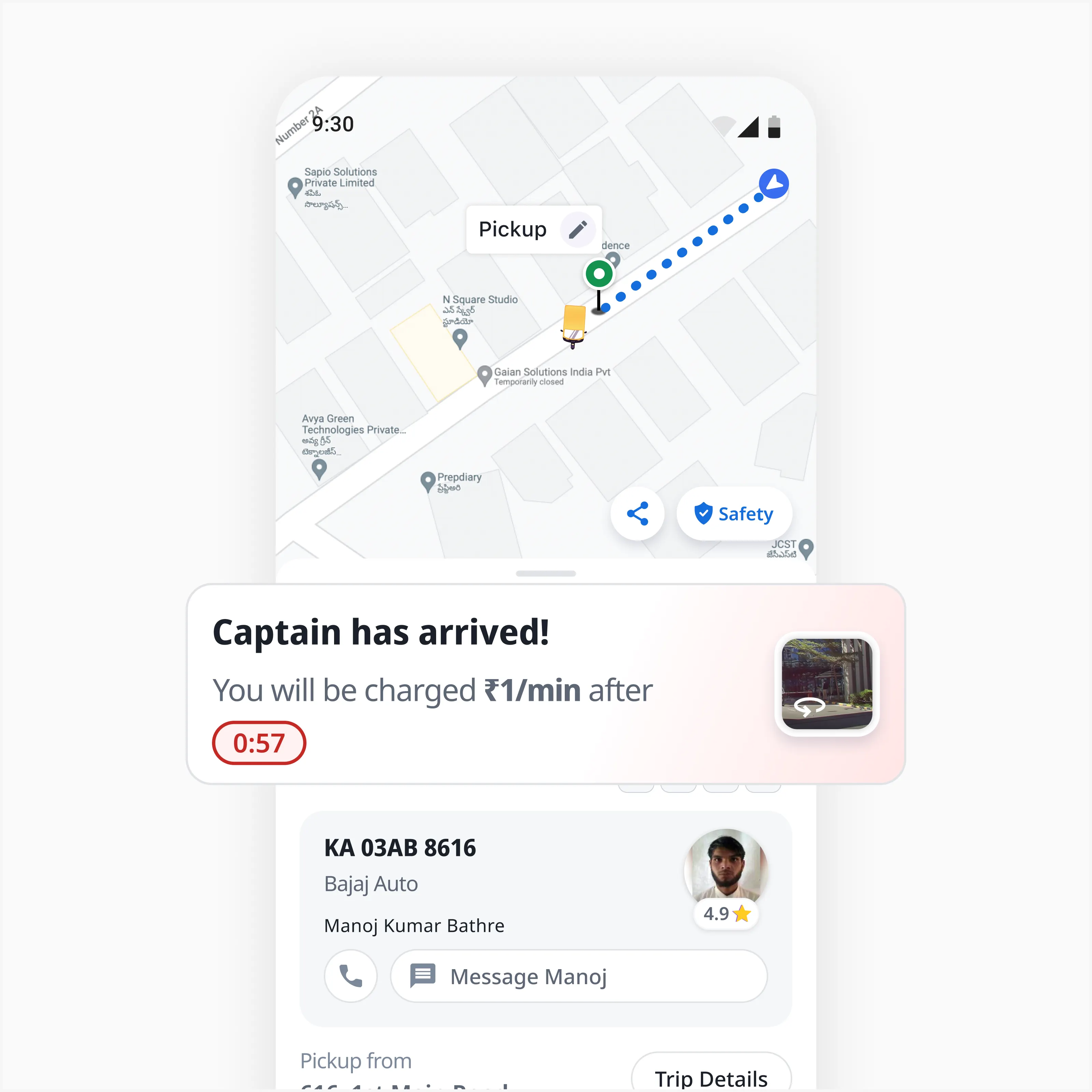
Scenario 4: Both at Pickup, Final Handshake
Design decision: Trigger the 3D pickup view when both user and captain are within 200 meters.
Why: This is the most frustrating moment. Both parties are right there but can't see each other. The 3D view solves orientation: "The captain is approaching from the north, look left."
The invisible detail: The captain's icon isn't static—it shows directional movement with a subtle trail effect. Users can see not just where the captain is, but where they're heading. This reduces false starts ("Oh wait, they're turning around").
The constraint I designed around: 3D rendering is battery-intensive. To prevent drain, the 3D view auto-reverts to 2D after 45 seconds of inactivity. We also optimized the rendering pipeline to use lower-poly building models, which reduced battery usage by 30% without noticeable visual degradation.

How I Measured Success (And Early Signals)
The ultimate metric is cancellation rate during pickup, but that's a lagging indicator. Here are the leading indicators I tracked:
Time to first movement: How quickly users start walking after booking (Target: <10 seconds)
Street View engagement rate: % of users who open Street View when prompted (Target: >40%)
Average distance at pickup: How far apart user and captain are when the ride starts (Target: <20 meters)
Wait timer visibility: Time spent viewing the wait timer when captain is waiting (Target: >8 seconds)
Early Results:
-10.27%
Reduction in cacellations
+8.61%
Increase in pickup accuracy
+7.43%
Gain in fulfilment
+50%
Improvement in time to 1st movement
But the most meaningful signal wasn't quantitative, it was qualitative. In follow-up interviews, users said the app felt "smarter" and "less stressful." One user said: "It's like the app knows what I'm thinking."
That's the quiet intelligence. Not flashy features, but thoughtful orchestration of the right information at the right time.
What I'd Do Differently
Test the new flow earlier: We validated each experiment independently, but didn't test how they'd work together until later. Running a hybrid experiment (e.g., walking guidance + Street View) would have surfaced integration issues sooner.
Invest in better instrumentation: We had basic analytics, but I wanted more granular data—like which parts of Street View users looked at most, or how many times they toggled between 2D and 3D. This would have helped optimize the micro-interactions.
Build for edge cases from the start: The 200-meter trigger for 3D view worked well in cities, but in rural or low-connectivity areas, GPS accuracy degraded. We later added a fallback to show the 3D view based on time (e.g., when captain is <2 minutes away) rather than just distance.
Real Users, Real Impact
Beyond the metrics, what validated this work most was hearing directly from users. The pickup improvements started gaining organic attention on LinkedIn, with users sharing their experiences and appreciating the thoughtful details.

Seeing users notice and appreciate the "quiet intelligence", the small details we obsessed over, reinforced that thoughtful design doesn't go unnoticed. When you solve real friction points with context-aware solutions, users feel it.
Context Is the Design
The breakthrough wasn't in any single feature—it was in understanding that pickup isn't one problem, it's four distinct problems disguised as one experience.
Users don't need a better map. They need the right map at the right moment.
They don't need more information. They need relevant information when it matters.
This project taught me that good design isn't about adding features, it's about orchestrating them. It's the invisible choreography that makes an experience feel seamless, even when it's technically complex under the hood.
And sometimes, the hardest design challenge isn't solving the problem. It's figuring out what to do when all your solutions work.