

Dec '25 - Feb '26
How Cross-Sell Taught Us What Users Actually Want
Reduce Cancellations
UX Journey
Dec '25 - Feb '26
How Cross-Sell Taught Us What Users Actually Want
Reduce Cancellations
UX Journey
UX Journey
+14%
+14%
Feature Adoption
Feature Adoption
-8%
-8%
Reduction in cancellations
Reduction in cancellations

A user stuck in traffic, watching their Auto request go nowhere
It's 7 PM in Bangalore. Peak hour. A user books an Auto to get home.
The screen says: "12 of 37 captains didn't accept your ride."
They wait. 30 seconds. A minute. No captain is accepting.
What they don't know: Auto supply in their area is dry right now. But there are 4 Cabs sitting 2 minutes away, ready to go.
They have no way to see this. So they do what millions of Rapido users do every day they cancel, and rebook with Cab. Another 2-3 minutes lost or they give up entirely and open a competitor's app.
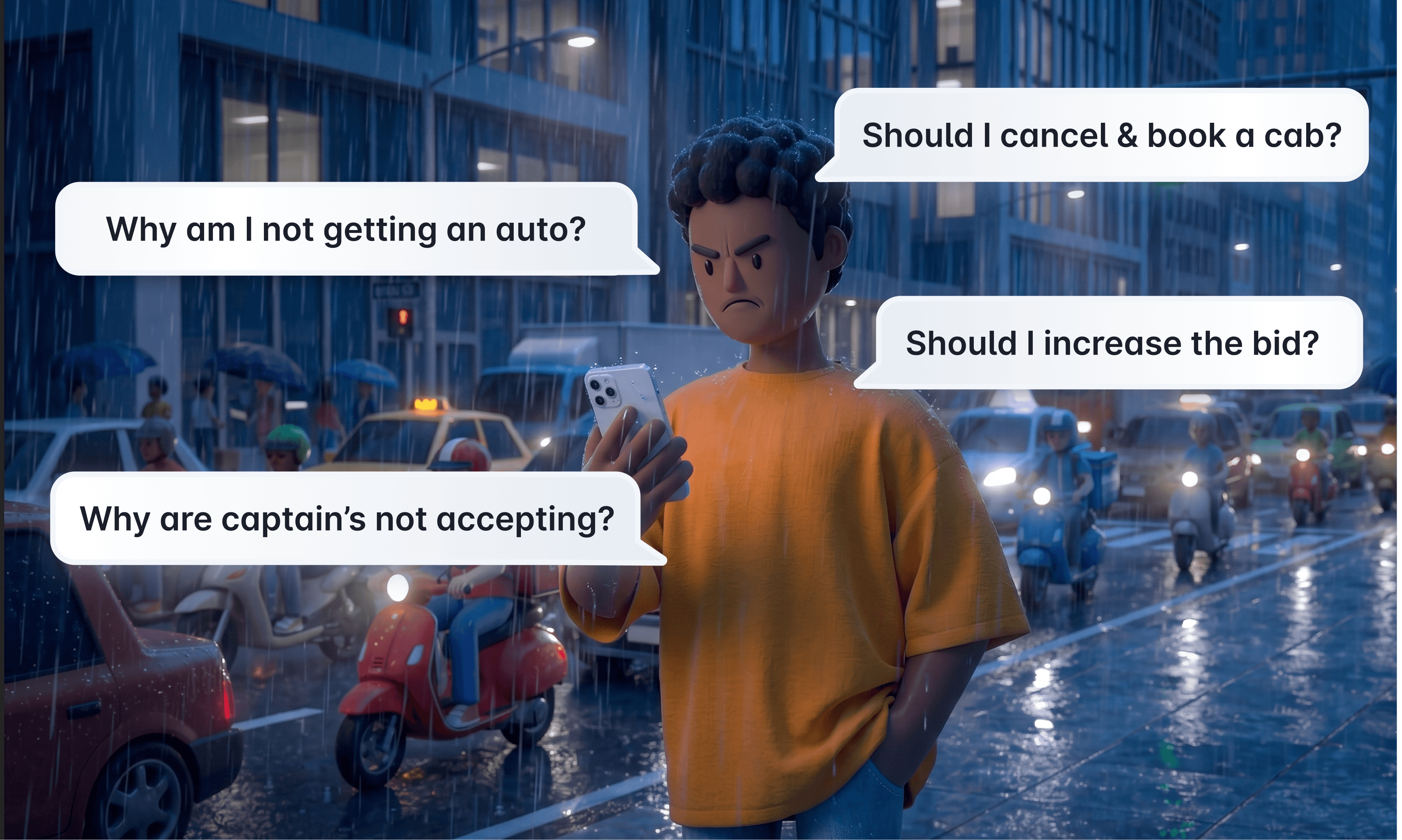
When your chosen service has no supply, you're locked into a guessing game
Cancel and retry. Cancel and retry. Until you get a ride or give up.
The cost of this was real:
Users wasted time and got frustrated
Rapido lost rides, and GMV every time someone abandoned the app
We had data confirming users were already solving this manually. In Bangalore, ~10% of Bike users would cancel low-supply Bike orders and rebook Auto. Users wanted to switch when their first choice wasn't working, they just had to do it the painful way, blind to where supply actually was.
The question I set out to answer:
How do we let users expand their search across services, without forcing them to cancel, guess, and start over?

Why this problem is harder than it looks
On our platform, we have multiple services a user can choose. Auto, Bike, Cab, Scooty, etc each with different price points, vehicle types, and supply pools.
This matters because a user booking Auto isn't just picking a price. They're picking:
Auto: Solo transport, short local routes, tight budgets
Cab: Comfort, longer trips, multiple passengers, professional context
Bike: Cheapest, fastest through traffic, single rider
When Auto has no supply but Cab does, the user has no way to know. And even if they did, switching from Auto to Cab isn't a trivial swap, it changes their price, their vehicle, their whole experience.
So the design challenge wasn't just "show users other options." It was: how do you surface alternatives during the highest-stress moment of the journey, finger hovering over cancel, without overwhelming them?

The hypothesis (and the evidence that shaped it)
Before designing anything, we already had pilot data from two cities.
When users select a ride type with low availability (e.g., Auto), they face unpredictable wait times and may cancel or re-book manually. Even when faster alternatives (e.g., Cabs) are nearby, users aren't informed in a simple, trusted way.
Core Hypothesis:
If we surface faster options (time + price visible) when predicted fulfillment probability is high and price delta is acceptable, then we will increase meaningful adoption and improve fulfillment and time-to-match with minimal negative impact on cancellations or trust.
Key Assumptions:
Time sensitive users are not very price sensitive. High local availability + high fulfillment probability ⇒ faster actual allocation. Users will accept a modest price premium for meaningful time savings
The evidence:
Chennai (Cab -> Auto)
Users in Chennai cancelled their cab bookings to book an auto.
CTR ~11%, Adoption ~17%, Fulfillment uplift +1.8%
Insight: Strong validation that users will switch when faster, reliable alternatives are shown with clear value
Caveat: "Auto is cheaper than Cab, hence the perceived adoption is higher. It might not be as high if it were Auto to Cab"
Bangalore (Bike → Auto)
~10% of Bike users cancel and rebook Auto when Bike availability is low
Insight: Users already perform manual mode switching to save time. Enabling this in-app will reduce friction and improve fulfillment.
Combined takeaway: Users are willing to change modes when time-sensitive, provided the value (speed + acceptable price delta) is visible and trustworthy.

The pattern seemed clear. Users were desperate to get any ride. When their preferred service had no supply, they'd take whatever worked, cheaper (Chennai), or faster (Bangalore).
With this evidence, we designed cross-sell to give users multiple options across vehicle types, and let them choose based on their own context.
I didn't know which alternative would resonate for which user. So rather than guess, I built a system that showed the options transparently and let user behavior tell me the answer.
What I actually built
Decision 1: How does bids and cross sell work together?
The question: A user starts with Auto, adds Cab and Bike, then bids +₹30. Does that +₹30 apply only to Auto or to all three?

My first instinct was Auto only. It felt protective, budgets aren't uniform across vehicle types. Someone who taps +₹30 on an ₹80 Auto consented to a small premium; stacking it onto a ₹340 Cab could push them past what they meant to spend.
I reversed it because of who's actually standing at this fork.

Nobody reaches a post-cross-sell bid casually. By this point they're not price-shopping they're trying to get home. Restricting the bid to the original service would penalise the exact user trying hardest to get a ride. So the bid raises the floor across everything they've selected maximising the odds of any match.
The call: a bid placed after cross-sell raises the floor across every selected service not just the one the user started with.
Decision 2: What number nudges the user time, or supply?
The question: Availability was the signal users cared about so how do you show it? The obvious answer is ETA: "Cab 2 min away." Nothing motivates a waiting user like a ride that's close.

Near doesn't mean they'll accept. A captain 2 minutes away can decline; one 14 minutes away can accept. Show "2 min away," watch that captain bail, and you've manufactured the exact disappointment the feature exists to prevent.

The call: show how many captains each service has nearby, not an ETA because an ETA is a promise the marketplace can't keep.
Decision 3:
Multiple options, not a single recommendation
What I did:
Cross-sell showed multiple services users could add—Auto Priority, Cab XL, Bike, Link—not one algorithmic "best choice."
Why:
The pilot data showed different patterns in different cities. Chennai users wanted cheaper (Cab → Auto). Delhi users wanted premium (Auto → Cab). Bangalore users wanted faster (Bike → Auto).
I didn't know which would resonate for which user. So I gave them the menu.
The alternative I considered:
A single ML-powered "smart recommendation."
Why I didn't:
We didn't have enough data to train a good model
Users in high-stress moments want control, not to be told what to do
Showing options lets users apply their own context—budget urgency, comfort needs, time pressure
The trade-off: More options = more cognitive load. But clear pricing, distinct icons, and a scannable layout let users decide in 2-3 seconds.
This decision turned out to be critical for learning. By giving equal visibility to every option, the data would later reveal genuine user preferences rather than confirming my design bias.
Finding the right form: three iterations
Deciding to show multiple options was one thing. Deciding how took three iterations and each step removed a specific way the previous one could fail the user.
What I was measuring:
Iteration 1: the compact card grid.
Three small cards in a row, each with its own "Add" button and a price delta (+₹57, +₹63, +₹121). Two problems, and the second mattered more. The obvious one was density cramped, hard to scan. The deeper one was the deltas. "+₹57" looks helpful, but it hides the total: the real fare is base + delta + bid + surge-at-match. Anchoring users on a small increment sets a trap for fare shock at the worst possible moment, right when the ride confirms and they feel locked in.

Iteration 2: the e-commerce tiles.
Larger tiles, switched to absolute prices (₹257, ₹274, ₹359), plus a "recommended" tag and an accumulating "Add to search (2)" button. This fixed fare shock, no hidden math and matched the e-commerce browsing pattern we'd aligned on as a company, a familiar scan-and-add mental model. But the tiles spent heavy vertical space on imagery and left little room to communicate why one option beat another. On a screen competing with a user's anxiety, I wanted more decision-relevant information per row, not prettier tiles.

Iteration 3 (shipped): the Fare Estimate list.
A vertical list of selectable rows, each with a checkbox, an absolute price, and critically, a supply signal: "12 cabs around you." It won on three counts. Familiarity users already knew the Fare Estimate list pattern from elsewhere in the app, so there was zero learning curve at a high-stress moment.
The second line earned its space the row format gave each option a secondary line, and I spent it on the single most persuasive fact available: availability. "12 cabs around you" isn't decoration; it answers the only question that matters when your Auto market is dry will this actually get me a ride? And absolute pricing carried forward, so no delta trap.
The arc in one line: fix density and fare shock (1→2), then trade decoration for decision-relevant information (2→3).

The experiment
Phase 1: Bangalore & Hyderabad (2 weeks)
50% variant (cross-sell enabled), 50% control (no cross-sell)
Bangalore skews Auto-heavy; Hyderabad has a balanced supply mix
If it worked in both, it would likely work everywhere
What I was measuring:
Primary: Fulfillment rate
Secondary: Adoption rate (≥10% target)
Tertiary: Cancellation rate (ensure no negative impact)
Exploratory: Service mix, which combinations users actually picked
What I expected:
10-15% adoption
~1-2% fulfillment uplift (matching Chennai's +1.8%)
Cross-vehicle dominance (Auto→Cab, Bike→Auto—the patterns we'd seen)
What I got: Something very different.
The results, and the plot twist
Overall metrics: Success
Adoption: hit target
Fulfillment uplift: positive vs control
Cancellations: no negative impact
The hypothesis held. Users adopted cross-sell. Fulfillment improved. We'd succeeded.
Then I pulled the service mix data.

Users weren't switching vehicle types. They were staying within their category. Auto to Auto Priority, Cab to Cab AC, Bike to Bike Lite.
I stared at this for a solid minute.
Everything from Chennai, Delhi, and Bangalore said users would switch vehicle types. The national data said the opposite.
Users upgraded within their category, they never switched service type
I was in a review with the PM, data team, and operations, looking at the breakdown.
PM: "Auto Priority is the most popular cross-sell option. 52% of Auto users who engage pick it over Cab or Bike."
Me: "But that's not what we designed for. Chennai was Cab → Auto cross-vehicle. We were testing switching."
Data: "Look at this cut. Users who add Auto Priority have a 15% higher assignment rate than users who add Cab, even though Cab theoretically expands the supply pool more."
Me: "Why?"
Operations: "Because Auto Priority matches within the existing Auto captain pool, just with higher queue priority. Cab means switching to a different pool, different vehicle type, different pricing zone. That adds latency."
And it clicked.
Why users chose within-category over cross-vehicle
Users weren't thinking: "I need a ride, any ride will do."
They were thinking: "I need an Auto for this specific job—solo transport, local route, ₹100-200 budget. But I'm willing to pay ₹20 more to get it faster."
Within-category variants (Auto → Auto Priority):
Same vehicle type (what they actually want)
Same captain pool (faster matching)
Same mental model (just a price-speed trade-off)
Modest price premium (₹10-30 extra, not ₹100+)
Cross-vehicle options (Auto → Cab):
Different vehicle type (changes the entire experience)
Different captain pool (adds matching latency)
Different mental model (comfort vs budget)
Large price jump (₹100-200 extra)
Users had strong vehicle-type preferences. An Auto user isn't just someone who wants a cheap ride—they're someone who needs solo transport for local navigation. A Cab user isn't just someone willing to pay more they're someone who values comfort, professionalism, or has multiple passengers.
These aren't interchangeable.
But Auto vs Auto Priority? That's just a price-speed slider within the same core need.
Why the evidence misled us (or why we misread it)
Chennai: Cab → Auto, 17% adoption
The caveat said it plainly: "Auto is cheaper than Cab, hence perceived adoption is higher."
What we thought it meant: Users will switch vehicle types for speed.
What it actually meant: Users will switch to a cheaper option when their premium choice runs dry.
This was about price sensitivity, not vehicle-type flexibility.
Delhi: Auto → Cab, 11% adoption
Lower than Chennai, because Cab is more expensive. Users would pay the premium, but only when desperate.
What we should have asked:
What % switched to a cheaper alternative? (Chennai: 17%)
What % switched to a more expensive alternative? (Delhi: 11%)
What % would take a same-price variant with better availability?
We never tested that third scenario. And that's exactly what within-category variants are.
The evidence was directionally right (users adopt cross-sell) but mechanistically incomplete (we didn't understand why).
What I learned
1. Evidence can be directionally right but mechanically wrong. The pilots proved users adopt cross-sell. But the reason price sensitivity, not vehicle flexibility was different from what we assumed. Directional validation isn't mechanistic understanding.
2. The caveat is often the most important line. "Auto is cheaper than Cab, hence perceived adoption is higher." I read it. I noted it. I didn't internalize that it meant the data was measuring something other than what we thought. The caveat was the insight.
3. Design for learning first, optimization second. Equal weight wasn't optimal—it was neutral. And neutral is what let user behavior reveal the truth. An optimized-but-wrong V1 would've taught us nothing.
4. Users want what solves their actual problem, not what you think they want. We built for vehicle-type flexibility. Users wanted pricing flexibility within their preferred type. Same feature, different mechanism. We solved the right problem for the wrong reason—and that's okay, because we solved it.
The results
After a 2 week experiment, the data came back.
+14%
Feature Adoption
(Target was ≥10%)
-8%
Reduction in cancellations
Users who'd have given up, didn't
Let me contextualize these numbers
We beat our adoption target by 40%. And cancellations — the entire reason this feature existed, dropped 8%.
14% adoption doesn't sound dramatic until you consider what it's measuring. The dispatch screen works fine without it, you can just wait for your Auto.
14% means one in seven users, mid-booking, chose to actively expand their search rather than sit and wait. For an optional, self-serve action during a high-stress moment, that's strong intent. And we cleared our target comfortably, not marginally.
The 8% cancellation drop is the number that actually matters.
Adoption tells you people used it; the cancellation reduction tells you it worked.
These were users on the edge of giving up, finger over the cancel button, who instead found a ride. At Rapido's scale, where cancellations run into large daily volumes across the country, an 8% reduction compounds into:
Thousands of additional completed rides per month — rides that would otherwise have been abandoned
Retained GMV from users who'd have dropped off or switched to a competitor
And critically, this came with no negative impact on trust or cancellations elsewhere the hypothesis had explicitly worried that adding options during an anxious moment might backfire, overwhelm users, or increase drop-off. It didn't. The feature added a path forward without adding friction for the people who ignored it.
By every metric we set out to move, cross-sell was a success.
UX Journey
How people actually talked about it
You can measure a feature in adoption and cancellation numbers. You can also just watch what people say when they find it on their own. Within weeks of rollout, the feature started showing up in LinkedIn posts and X threads, product people dissecting it, users reacting to it. What they said validated the work and, in the same breath, pointed straight at its limit.
The product community read the intent immediately. One Head of Product framed it as "Rapido does it again… introducing a cart for different rides" - recognizing the e-commerce pattern we'd deliberately borrowed.

Another PM called it "a well packaged solution of keeping the user on the platform, in this world of multiple cab-aggregators." That's the retention thesis, understood by an outsider without us explaining it - exactly the strategic bet the feature was making.

And users liked it. One put it bluntly: "Booking multiple services at once to secure a ride is the best thing Rapido has done."

But look closely at the same posts and the honest tension is right there in the open:
"…and yet ironically with a high number of rejections."
"Though I got none even after 10 minutes."
The screenshots themselves: "178 of 191 captains didn't accept your ride." "154 of 157 didn't accept."
This is the most important signal in the whole set and it isn't the praise. People loved the experience of expanding their search, but several still didn't get a ride. That's the ceiling of what this feature could ever do, stated by the market more clearly than any internal doc could: cross-sell is a demand-side solution to a problem that is partly
supply-side. When there simply aren't enough captains in an area, giving a user more services to search across improves their odds, it casts a wider net, but it can't manufacture supply that isn't there.
That reframed how I hold this project. The 8% cancellation reduction was real, and the enthusiasm was real. But the public reaction drew the boundary honestly: better UX moved the needle on fulfillment, and it made the wait feel less helpless by giving users something productive to do. It did not, and could not, fix a dry market on its own. The most useful praise I got wasn't the compliment — it was the compliment with the "but," because it told me exactly where design stops and supply begins.
What I'd measure next
Test within-category variants explicitly: Auto → Auto Priority vs cross-vehicle baseline, with time-to-assignment for each
Segment adoption by price direction: cheaper vs same-price vs more expensive this alone would've revealed that "cheaper" drove Chennai's 17%
Measure matching speed, not just adoption: the assignment-rate gap is what explained why within-category won
The takeaway
We built a feature that worked. We just didn't know why it worked until after.
The hypothesis was right: users want faster options with transparent trade-offs. But the mechanism surprised us, users didn't switch vehicle types, they upgraded within them.
This isn't a failure. It's how product development works when you're pushing into new territory. You make educated guesses on the best available evidence. You ship. You learn. You iterate.
The users told us what they actually needed. We just had to listen to the data, even when it said something we didn't expect.
This project was a cross-functional effort. Special thanks to the data science team for the service mix analysis that became the core insight, engineering for shipping under tight timelines, and operations for surfacing the supply-side mechanics that explained the matching-speed difference.
A user stuck in traffic, watching their Auto request go nowhere
It's 7 PM in Bangalore. Peak hour. A user books an Auto to get home.
The screen says: "12 of 37 captains didn't accept your ride."
They wait. 30 seconds. A minute. No captain is accepting.
What they don't know: Auto supply in their area is dry right now. But there are 4 Cabs sitting 2 minutes away, ready to go.
They have no way to see this. So they do what millions of Rapido users do every day they cancel, and rebook with Cab. Another 2-3 minutes lost or they give up entirely and open a competitor's app.
When your chosen service has no supply, you're locked into a guessing game
Cancel and retry. Cancel and retry. Until you get a ride or give up.
The cost of this was real:
Users wasted time and got frustrated
Rapido lost rides, and GMV every time someone abandoned the app
We had data confirming users were already solving this manually. In Bangalore, ~10% of Bike users would cancel low-supply Bike orders and rebook Auto. Users wanted to switch when their first choice wasn't working, they just had to do it the painful way, blind to where supply actually was.
The question I set out to answer:
How do we let users expand their search across services, without forcing them to cancel, guess, and start over?
Why this problem is harder than it looks
On our platform, we have multiple services a user can choose. Auto, Bike, Cab, Scooty, etc each with different price points, vehicle types, and supply pools.
This matters because a user booking Auto isn't just picking a price. They're picking:
Auto: Solo transport, short local routes, tight budgets
Cab: Comfort, longer trips, multiple passengers, professional context
Bike: Cheapest, fastest through traffic, single rider
When Auto has no supply but Cab does, the user has no way to know. And even if they did, switching from Auto to Cab isn't a trivial swap, it changes their price, their vehicle, their whole experience.
So the design challenge wasn't just "show users other options." It was: how do you surface alternatives during the highest-stress moment of the journey, finger hovering over cancel, without overwhelming them?
The hypothesis (and the evidence that shaped it)
Before designing anything, we already had pilot data from two cities.
When users select a ride type with low availability (e.g., Auto), they face unpredictable wait times and may cancel or re-book manually. Even when faster alternatives (e.g., Cabs) are nearby, users aren't informed in a simple, trusted way.
Core Hypothesis:
If we surface faster options (time + price visible) when predicted fulfillment probability is high and price delta is acceptable, then we will increase meaningful adoption and improve fulfillment and time-to-match with minimal negative impact on cancellations or trust.
Key Assumptions:
Time sensitive users are not very price sensitive. High local availability + high fulfillment probability ⇒ faster actual allocation. Users will accept a modest price premium for meaningful time savings
The evidence:
Chennai (Cab -> Auto)
Users in Chennai cancelled their cab bookings to book an auto.
CTR ~11%, Adoption ~17%, Fulfillment uplift +1.8%
Insight: Strong validation that users will switch when faster, reliable alternatives are shown with clear value
Caveat: "Auto is cheaper than Cab, hence the perceived adoption is higher. It might not be as high if it were Auto to Cab"
Bangalore (Bike → Auto)
~10% of Bike users cancel and rebook Auto when Bike availability is low
Insight: Users already perform manual mode switching to save time. Enabling this in-app will reduce friction and improve fulfillment.
Combined takeaway: Users are willing to change modes when time-sensitive, provided the value (speed + acceptable price delta) is visible and trustworthy.
The pattern seemed clear. Users were desperate to get any ride. When their preferred service had no supply, they'd take whatever worked, cheaper (Chennai), or faster (Bangalore).
With this evidence, we designed cross-sell to give users multiple options across vehicle types, and let them choose based on their own context.
I didn't know which alternative would resonate for which user. So rather than guess, I built a system that showed the options transparently and let user behavior tell me the answer.
What I actually built
Decision 1: Which service does the bid apply to?
When users could add services and raise their bid (+₹10, +₹30, +₹50) on the same screen, a question surfaced with no obvious answer. If someone started with Auto, added Cab and Bike, then bid +₹30 does that +₹30 apply only to Auto, or to all three?
My first instinct was Auto only. It felt protective: budgets aren't uniform across vehicle types. A user who taps "+₹30" while looking at an ₹80 Auto has consented to a small, specific premium applying it on top of a ₹340 Cab could push them past what they meant to spend.
I reversed it, and the reason is who's actually standing at this fork. Nobody reaches "bidding after cross-sell" casually. They've almost always already booked their preferred service, waited without a match, bid on that service alone, still not gotten fulfilled, and only then added more services and bid again. By this point they aren't price-shopping — they're trying to get home. The moment itself is a desperation signal, built from a chain of escalating actions all aimed at the same unmet need.
Restricting the bid to the original service would penalize the exact user trying hardest to get a ride. So the bid raises the floor across everything they've selected, maximizing the odds of any match.
The honest trade-off: if the original service was dry but an added service had healthy supply, the user pays a small premium on a ride that might've matched at base price anyway. I accepted that — the whole reason they're this deep is that matching hasn't been working, so optimizing for a match outweighs a marginal overpay. How often that edge case fires is exactly what I'd measure before refining it.
The call: a bid placed after cross-sell raises the floor across every selected service not just the one the user started with.
Decision 1: Which service does the bid apply to?
When users could add services and raise their bid (+₹10, +₹30, +₹50) on the same screen, a question surfaced with no obvious answer. If someone started with Auto, added Cab and Bike, then bid +₹30 does that +₹30 apply only to Auto, or to all three?
My first instinct was Auto only. It felt protective: budgets aren't uniform across vehicle types. A user who taps "+₹30" while looking at an ₹80 Auto has consented to a small, specific premium applying it on top of a ₹340 Cab could push them past what they meant to spend.
I reversed it, and the reason is who's actually standing at this fork. Nobody reaches "bidding after cross-sell" casually. They've almost always already booked their preferred service, waited without a match, bid on that service alone, still not gotten fulfilled, and only then added more services and bid again. By this point they aren't price-shopping — they're trying to get home. The moment itself is a desperation signal, built from a chain of escalating actions all aimed at the same unmet need.
Restricting the bid to the original service would penalize the exact user trying hardest to get a ride. So the bid raises the floor across everything they've selected, maximizing the odds of any match.
The honest trade-off: if the original service was dry but an added service had healthy supply, the user pays a small premium on a ride that might've matched at base price anyway. I accepted that — the whole reason they're this deep is that matching hasn't been working, so optimizing for a match outweighs a marginal overpay. How often that edge case fires is exactly what I'd measure before refining it.
The call: a bid placed after cross-sell raises the floor across every selected service not just the one the user started with.
Decision 1: Which service does the bid apply to?
When users could add services and raise their bid (+₹10, +₹30, +₹50) on the same screen, a question surfaced with no obvious answer. If someone started with Auto, added Cab and Bike, then bid +₹30 does that +₹30 apply only to Auto, or to all three?
My first instinct was Auto only. It felt protective: budgets aren't uniform across vehicle types. A user who taps "+₹30" while looking at an ₹80 Auto has consented to a small, specific premium applying it on top of a ₹340 Cab could push them past what they meant to spend.
I reversed it, and the reason is who's actually standing at this fork. Nobody reaches "bidding after cross-sell" casually. They've almost always already booked their preferred service, waited without a match, bid on that service alone, still not gotten fulfilled, and only then added more services and bid again. By this point they aren't price-shopping — they're trying to get home. The moment itself is a desperation signal, built from a chain of escalating actions all aimed at the same unmet need.
Restricting the bid to the original service would penalize the exact user trying hardest to get a ride. So the bid raises the floor across everything they've selected, maximizing the odds of any match.
The honest trade-off: if the original service was dry but an added service had healthy supply, the user pays a small premium on a ride that might've matched at base price anyway. I accepted that — the whole reason they're this deep is that matching hasn't been working, so optimizing for a match outweighs a marginal overpay. How often that edge case fires is exactly what I'd measure before refining it.
The call: a bid placed after cross-sell raises the floor across every selected service not just the one the user started with.
Decision 2: What number nudges the user time, or supply?
The question: Availability was the signal users cared about so how do you show it? The obvious answer is ETA: "Cab 2 min away." Nothing motivates a waiting user like a ride that's close.
Near doesn't mean they'll accept. A captain 2 minutes away can decline; one 14 minutes away can accept. Show "2 min away," watch that captain bail, and you've manufactured the exact disappointment the feature exists to prevent.
The call: show how many captains each service has nearby, not an ETA because an ETA is a promise the marketplace can't keep.
Decision 3:
Multiple options, not a single recommendation
What I did:
Cross-sell showed multiple services users could add—Auto Priority, Cab XL, Bike, Link—not one algorithmic "best choice."
Why:
The pilot data showed different patterns in different cities. Chennai users wanted cheaper (Cab → Auto). Delhi users wanted premium (Auto → Cab). Bangalore users wanted faster (Bike → Auto).
I didn't know which would resonate for which user. So I gave them the menu.
The alternative I considered:
A single ML-powered "smart recommendation."
Why I didn't:
We didn't have enough data to train a good model
Users in high-stress moments want control, not to be told what to do
Showing options lets users apply their own context—budget urgency, comfort needs, time pressure
The trade-off: More options = more cognitive load. But clear pricing, distinct icons, and a scannable layout let users decide in 2-3 seconds.
This decision turned out to be critical for learning. By giving equal visibility to every option, the data would later reveal genuine user preferences rather than confirming my design bias.
Finding the right form: three iterations
Deciding to show multiple options was one thing. Deciding how took three iterations and each step removed a specific way the previous one could fail the user.
What I was measuring:
Iteration 1: the compact card grid.
Three small cards in a row, each with its own "Add" button and a price delta (+₹57, +₹63, +₹121). Two problems, and the second mattered more. The obvious one was density cramped, hard to scan. The deeper one was the deltas. "+₹57" looks helpful, but it hides the total: the real fare is base + delta + bid + surge-at-match. Anchoring users on a small increment sets a trap for fare shock at the worst possible moment, right when the ride confirms and they feel locked in.
Iteration 2: the e-commerce tiles.
Larger tiles, switched to absolute prices (₹257, ₹274, ₹359), plus a "recommended" tag and an accumulating "Add to search (2)" button. This fixed fare shock, no hidden math and matched the e-commerce browsing pattern we'd aligned on as a company, a familiar scan-and-add mental model. But the tiles spent heavy vertical space on imagery and left little room to communicate why one option beat another. On a screen competing with a user's anxiety, I wanted more decision-relevant information per row, not prettier tiles.
Iteration 3 (shipped): the Fare Estimate list.
A vertical list of selectable rows, each with a checkbox, an absolute price, and critically, a supply signal: "12 cabs around you." It won on three counts. Familiarity users already knew the Fare Estimate list pattern from elsewhere in the app, so there was zero learning curve at a high-stress moment.
The second line earned its space the row format gave each option a secondary line, and I spent it on the single most persuasive fact available: availability. "12 cabs around you" isn't decoration; it answers the only question that matters when your Auto market is dry will this actually get me a ride? And absolute pricing carried forward, so no delta trap.
The arc in one line: fix density and fare shock (1→2), then trade decoration for decision-relevant information (2→3).
The experiment
Phase 1: Bangalore & Hyderabad (2 weeks)
50% variant (cross-sell enabled), 50% control (no cross-sell)
Bangalore skews Auto-heavy; Hyderabad has a balanced supply mix
If it worked in both, it would likely work everywhere
What I was measuring:
Primary: Fulfillment rate
Secondary: Adoption rate (≥10% target)
Tertiary: Cancellation rate (ensure no negative impact)
Exploratory: Service mix, which combinations users actually picked
What I expected:
10-15% adoption
~1-2% fulfillment uplift (matching Chennai's +1.8%)
Cross-vehicle dominance (Auto→Cab, Bike→Auto—the patterns we'd seen)
What I got: Something very different.
The results, and the plot twist
Overall metrics: Success
Adoption: hit target
Fulfillment uplift: positive vs control
Cancellations: no negative impact
The hypothesis held. Users adopted cross-sell. Fulfillment improved. We'd succeeded.
Then I pulled the service mix data.
Users weren't switching vehicle types. They were staying within their category. Auto to Auto Priority, Cab to Cab AC, Bike to Bike Lite.
I stared at this for a solid minute.
Everything from Chennai, Delhi, and Bangalore said users would switch vehicle types. The national data said the opposite.
Users upgraded within their category, they never switched service type
I was in a review with the PM, data team, and operations, looking at the breakdown.
PM: "Auto Priority is the most popular cross-sell option. 52% of Auto users who engage pick it over Cab or Bike."
Me: "But that's not what we designed for. Chennai was Cab → Auto cross-vehicle. We were testing switching."
Data: "Look at this cut. Users who add Auto Priority have a 15% higher assignment rate than users who add Cab, even though Cab theoretically expands the supply pool more."
Me: "Why?"
Operations: "Because Auto Priority matches within the existing Auto captain pool, just with higher queue priority. Cab means switching to a different pool, different vehicle type, different pricing zone. That adds latency."
And it clicked.
Why users chose within-category over cross-vehicle
Users weren't thinking: "I need a ride, any ride will do."
They were thinking: "I need an Auto for this specific job—solo transport, local route, ₹100-200 budget. But I'm willing to pay ₹20 more to get it faster."
Within-category variants (Auto → Auto Priority):
Same vehicle type (what they actually want)
Same captain pool (faster matching)
Same mental model (just a price-speed trade-off)
Modest price premium (₹10-30 extra, not ₹100+)
Cross-vehicle options (Auto → Cab):
Different vehicle type (changes the entire experience)
Different captain pool (adds matching latency)
Different mental model (comfort vs budget)
Large price jump (₹100-200 extra)
Users had strong vehicle-type preferences. An Auto user isn't just someone who wants a cheap ride—they're someone who needs solo transport for local navigation. A Cab user isn't just someone willing to pay more they're someone who values comfort, professionalism, or has multiple passengers.
These aren't interchangeable.
But Auto vs Auto Priority? That's just a price-speed slider within the same core need.
Why the evidence misled us (or why we misread it)
Chennai: Cab → Auto, 17% adoption
The caveat said it plainly: "Auto is cheaper than Cab, hence perceived adoption is higher."
What we thought it meant: Users will switch vehicle types for speed.
What it actually meant: Users will switch to a cheaper option when their premium choice runs dry.
This was about price sensitivity, not vehicle-type flexibility.
Delhi: Auto → Cab, 11% adoption
Lower than Chennai, because Cab is more expensive. Users would pay the premium, but only when desperate.
What we should have asked:
What % switched to a cheaper alternative? (Chennai: 17%)
What % switched to a more expensive alternative? (Delhi: 11%)
What % would take a same-price variant with better availability?
We never tested that third scenario. And that's exactly what within-category variants are.
The evidence was directionally right (users adopt cross-sell) but mechanistically incomplete (we didn't understand why).
What I learned
1. Evidence can be directionally right but mechanically wrong. The pilots proved users adopt cross-sell. But the reason price sensitivity, not vehicle flexibility was different from what we assumed. Directional validation isn't mechanistic understanding.
2. The caveat is often the most important line. "Auto is cheaper than Cab, hence perceived adoption is higher." I read it. I noted it. I didn't internalize that it meant the data was measuring something other than what we thought. The caveat was the insight.
3. Design for learning first, optimization second. Equal weight wasn't optimal—it was neutral. And neutral is what let user behavior reveal the truth. An optimized-but-wrong V1 would've taught us nothing.
4. Users want what solves their actual problem, not what you think they want. We built for vehicle-type flexibility. Users wanted pricing flexibility within their preferred type. Same feature, different mechanism. We solved the right problem for the wrong reason—and that's okay, because we solved it.
The results
After a 2 week experiment, the data came back.
+14%
Feature Adoption
(Target was ≥10%)
-8%
Reduction in cancellations
Users who'd have given up, didn't
Let me contextualize these numbers
We beat our adoption target by 40%. And cancellations — the entire reason this feature existed, dropped 8%.
14% adoption doesn't sound dramatic until you consider what it's measuring. The dispatch screen works fine without it, you can just wait for your Auto.
14% means one in seven users, mid-booking, chose to actively expand their search rather than sit and wait. For an optional, self-serve action during a high-stress moment, that's strong intent. And we cleared our target comfortably, not marginally.
The 8% cancellation drop is the number that actually matters.
Adoption tells you people used it; the cancellation reduction tells you it worked.
These were users on the edge of giving up, finger over the cancel button, who instead found a ride. At Rapido's scale, where cancellations run into large daily volumes across the country, an 8% reduction compounds into:
Thousands of additional completed rides per month — rides that would otherwise have been abandoned
Retained GMV from users who'd have dropped off or switched to a competitor
And critically, this came with no negative impact on trust or cancellations elsewhere the hypothesis had explicitly worried that adding options during an anxious moment might backfire, overwhelm users, or increase drop-off. It didn't. The feature added a path forward without adding friction for the people who ignored it.
By every metric we set out to move, cross-sell was a success.
UX Journey
How people actually talked about it
You can measure a feature in adoption and cancellation numbers. You can also just watch what people say when they find it on their own. Within weeks of rollout, the feature started showing up in LinkedIn posts and X threads, product people dissecting it, users reacting to it. What they said validated the work and, in the same breath, pointed straight at its limit.
The product community read the intent immediately. One Head of Product framed it as "Rapido does it again… introducing a cart for different rides" - recognizing the e-commerce pattern we'd deliberately borrowed.
Another PM called it "a well packaged solution of keeping the user on the platform, in this world of multiple cab-aggregators." That's the retention thesis, understood by an outsider without us explaining it - exactly the strategic bet the feature was making.
And users liked it. One put it bluntly: "Booking multiple services at once to secure a ride is the best thing Rapido has done."
But look closely at the same posts and the honest tension is right there in the open:
"…and yet ironically with a high number of rejections."
"Though I got none even after 10 minutes."
The screenshots themselves: "178 of 191 captains didn't accept your ride." "154 of 157 didn't accept."
This is the most important signal in the whole set and it isn't the praise. People loved the experience of expanding their search, but several still didn't get a ride. That's the ceiling of what this feature could ever do, stated by the market more clearly than any internal doc could: cross-sell is a demand-side solution to a problem that is partly
supply-side. When there simply aren't enough captains in an area, giving a user more services to search across improves their odds, it casts a wider net, but it can't manufacture supply that isn't there.
That reframed how I hold this project. The 8% cancellation reduction was real, and the enthusiasm was real. But the public reaction drew the boundary honestly: better UX moved the needle on fulfillment, and it made the wait feel less helpless by giving users something productive to do. It did not, and could not, fix a dry market on its own. The most useful praise I got wasn't the compliment — it was the compliment with the "but," because it told me exactly where design stops and supply begins.
What I'd measure next
Test within-category variants explicitly: Auto → Auto Priority vs cross-vehicle baseline, with time-to-assignment for each
Segment adoption by price direction: cheaper vs same-price vs more expensive this alone would've revealed that "cheaper" drove Chennai's 17%
Measure matching speed, not just adoption: the assignment-rate gap is what explained why within-category won
The takeaway
We built a feature that worked. We just didn't know why it worked until after.
The hypothesis was right: users want faster options with transparent trade-offs. But the mechanism surprised us, users didn't switch vehicle types, they upgraded within them.
This isn't a failure. It's how product development works when you're pushing into new territory. You make educated guesses on the best available evidence. You ship. You learn. You iterate.
The users told us what they actually needed. We just had to listen to the data, even when it said something we didn't expect.
This project was a cross-functional effort. Special thanks to the data science team for the service mix analysis that became the core insight, engineering for shipping under tight timelines, and operations for surfacing the supply-side mechanics that explained the matching-speed difference.