

June '25 - July '25
How we increased fulfillment for airport rides
Increase Fulfillment
On-field Research
UX Journey
+11%
Gain in Fulfillment
-9%
Reduction in cancellations
Jun '25 - Jul '26
How we increased fulfillment for airport rides
Increase Fulfillment
On-field Research
UX Journey
+11%
Gain in Fulfillment
-9%
Reduction in cancellations

Why most users never found us at the airports
Here's what most case studies won't tell you: the hardest problems to solve aren't the ones with obvious solutions. They're the ones where everything looks fine on paper, but something invisible is breaking the experience.
For months, our airport rides sat at 63% fulfillment with 28% cancellations. The operations team kept saying, "Users can't find the pickup zone." Product kept saying, "The information is all there."
Everyone was right. And everyone was wrong.
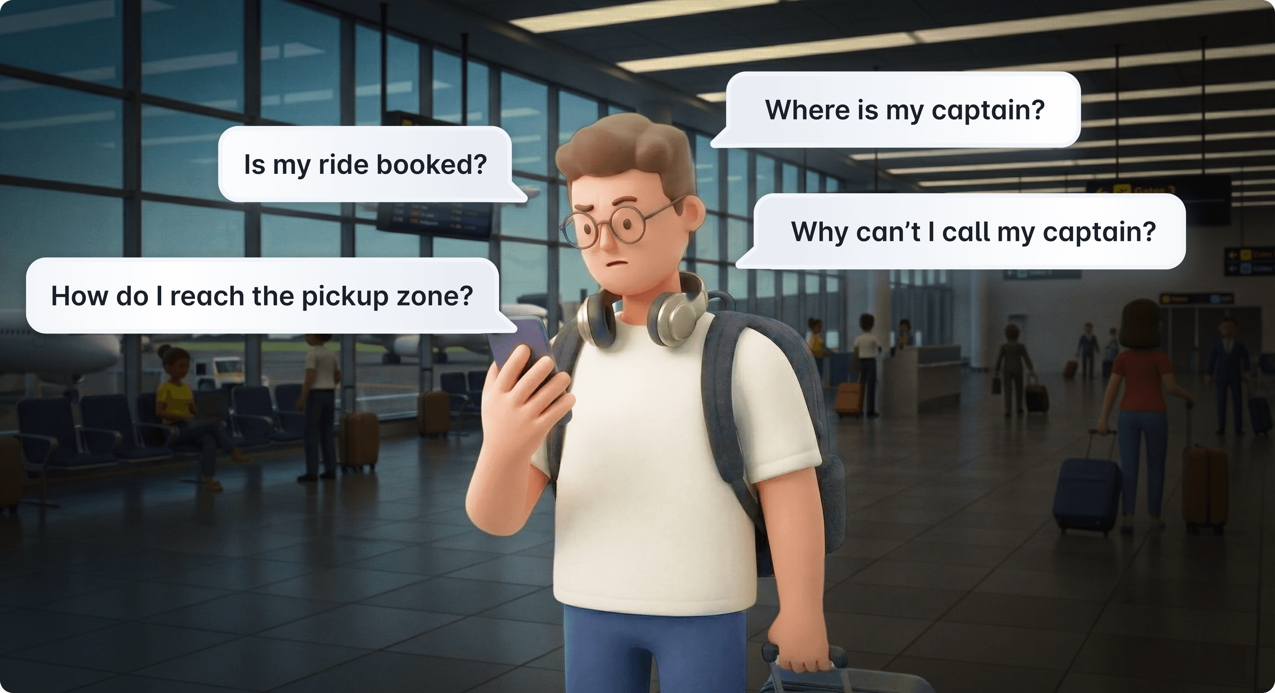
The information was there. Users just never saw it. And when anxiety kicks in at an airport, luggage in hand, loaded with flight anxiety, it was super difficult for the user to consume the mish-mash of information.
The decision to go to the source
I could have started with user interviews in a conference room. Asked people to recall their last airport pickup experience. Drawn insights from memory.
Instead, I chose to go directly to Delhi and Hyderabad airports during peak hours. Not to interview. To observe.
Why this mattered: Memory is unreliable, especially under stress. I needed to see what users did when they were actually anxious, not what they remembered doing weeks later. I needed to catch micro-behaviors—the moments of hesitation, the frantic phone checking, the looking around for landmarks.
Research method aside, there was something else: Rapido's airport model is fundamentally different from our regular rides. There's no captain assigned to you. No tracking. No phone number to call. You walk to a designated zone, show an OTP to the next available captain, and go.
This "OTP and Go" model is operationally efficient but creates a unique design problem: How do you guide someone when there's no one to guide them?

Delhi Airport Terminal-3
Dozens of conversations, one clear insight
Standing near our pickup zones, I started approaching users who'd successfully made it there. "How did you find this place?"
About 40% mentioned using the "Get Directions" feature—an image-based carousel showing landmarks, pillars, and pathways. They'd scroll through, spot something familiar, and follow the visual breadcrumbs.

The insight that changed everything: The image guidance wasn't broken. It was just invisible to the people who needed it most, the anxious, rushed, first-time users who would never think to tap a "Get Directions" button.
The feature was hidden behind a tap. And in high-stress environments, every tap is a cognitive barrier.

The old image guidance flow
Reframing the problem statement
At Terminal 3, we discovered something that reframed the entire problem.
Our pickup zone was on Level 3 of the multi-level parking structure. Our competitors? Ground floor. The most accessible, intuitive location.
This wasn't just about wayfinding anymore. Users weren't looking for directions to a zone, they were looking for directions to a zone they didn't know was on the third floor of a parking garage.
On-field user testing
Right there at the airport, we created quick mockup prototypes. Then we did something unconventional: we pretended to be lost Rapido users ourselves.

The mockup we tested at the airport
We approached travelers and said, “Excuse me, we’re trying to find the Rapido pickup. Can you help us understand this screen?”
The responses were split:
Some users (clearly in a hurry): “I know where [competitor] is on the ground floor, but no idea about Rapido. Sorry, I’m late for my flight.”
Others (taking a moment to read): They’d scan the screen and point out, “It says here ‘Take lift to 3rd floor’, maybe try that?”
That was our aha moment. The screen worked for users who had time to read carefully. The comprehension was barely there.
But what about users in a rush? Users with luggage? Users who just wanted to get home?
Yet another plot twist
When we got back and pulled the Kepler location data—showing where users booked and where they canceled, the picture became painfully clear.

Kepler distribution of booking started (red) vs booking cancelled (yellow)
Cancellations were everywhere. Ground floor. Departure level. Near competitor zones. Random hallways.
Users weren't just confused about how to get there. They fundamentally didn't know where "there" was. And when anxiety peaked, they hit cancel.
Why this data mattered: It confirmed that textual directions alone—no matter how clear weren't enough. Users needed visual anchors they could match to their physical surroundings in real-time.
Breaking down the screen from first principles
Back at the office, I had a hypothesis: If users could confidently navigate to the pickup point, cancellations would drop.
But before jumping into solutions, I needed to understand what wasn't working about the existing post-booking screen.

The old UI screen for airport orders
The screen was designed like as if you wait for the captain to come to you. The map showed your location. The OTP was front and center. But in an airport ride, you're the one moving, not the captain. The hierarchy needed to reflect that.
The problem wasn't what was there. It was what the design prioritized.

Prioritizing by actual user anxiety, not assumed importance. I broke down the user's mental state from the moment they book.
P0 - Assurance:
"Do I actually have a ride? Is someone waiting?"
Users need immediate confirmation that their booking succeeded and a captain will be there.
P1 - Wayfinding:
"Where am I? Where do I need to go? How do I get there?"
This is where users spend the most cognitive energy and where they cancel if anxious.
P2 - Help:
"I'm lost. Who can I call?"
Without captain details, users had no one to reach out to.
The design decision: Restructure the screen to address P0 immediately, surface P1 information without requiring a tap, and provide a P2 safety net.
Three small decisions that compounded into measurable impact
Sometimes the best way forward is to step back, observe how people actually behave, and design for reality.

The new re-designed airport experience
Elevating Image Guidance from L2 to L1
What I changed: Removed the "Get Directions" button entirely and brought the full image carousel to the top of the screen, immediately visible after booking.
Why this was hard: It meant pushing the "Trip Details" section (which contained the cancel button) down the screen. Stakeholders worried: "Won't hiding trip details frustrate users?"
The intentional friction: Yes, it would create a tiny bit of friction. But that was the point.
Previously, the behavior pattern was:
User books ride
User feels anxious about where to go
User scrolls to "Trip Details"
User cancels
By placing images upfront, users were forced to scroll through visual wayfinding first. Even if image 1 didn't resonate, maybe image 3 showed a familiar Starbucks or escalator.
The cognitive pattern shifted from "I don't know what to do → Cancel" to "Let me scan these images first → Oh, I see that landmark."
The trade-off I accepted: Power users who frequently book airport rides might find the new layout unfamiliar initially. But the data showed first-time and infrequent users were the ones canceling—and they needed guidance more than familiarity.
Context-Aware OTP Display
The OTP was the second major design decision. The OTP was always displayed prominently, even when it wasn't relevant yet.

Think about the user's journey: You've just booked. You're still at the baggage claim. You need to find the pickup point. The OTP is useless right now. Yet it's sitting there, taking up valuable screen real estate.
What I changed: Made the OTP sticky at the bottom but visually de-emphasized (low contrast, smaller size) until the user's location indicated they were near the pickup zone. Once within proximity, the OTP automatically became bold, high-contrast, and prominent.
Why this mattered: It's a small detail, but it's the kind of quiet intelligence that reduces cognitive load. The screen adapts to the user's context, not the other way around. When you're navigating, navigation tools are prominent. When you need to show your OTP, it's front and center.
The constraint I worked within: We couldn't use GPS tracking inside terminals (spotty signals). So I worked with engineering to use geofencing at a radius level, imperfect, but good enough to trigger the OTP state change when users were close.
The operator call layer acting as a safety net
The operator call layer was the third major design decision. It was specially for users who were essentially lost.
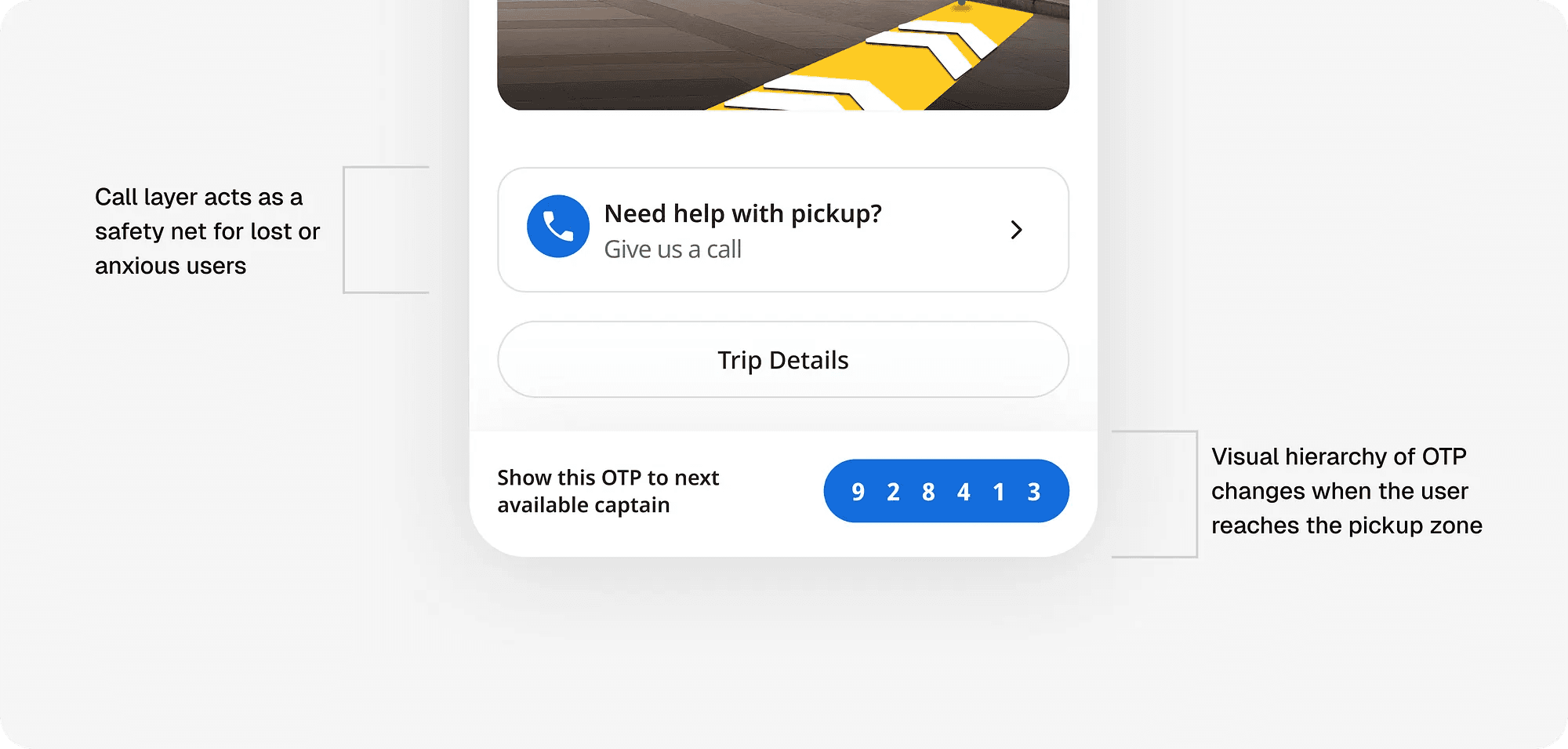
The problem: No captain details meant users had no one to call when lost. Anxiety had no outlet.
What I didn't do: Add a generic "Contact Support" button that routes to a call center queue.
What I did instead: Worked with our airport operations team—the folks physically present at our pickup kiosks—and created a direct line to them.
Why this specific solution: These operators already knew the terminal layouts, and could give step-by-step directions. They weren't reading from a script they were looking at the same airport the user was in.
The unexpected outcome: Most users never called. Just knowing the option existed reduced anxiety enough for them to try navigating on their own first. It was a psychological safety net more than an actual support channel.
Measuring impact: We tracked call volume to operators and support tickets related to "can't find pickup." Both dropped, but more importantly, cancellations dropped, meaning users weren't even reaching the point of needing help.
Changing mental models
Not everyone was immediately sold on the redesign.
The pushback centered on one concern: “We’re changing users’ existing mental model. Won’t this confuse them?”
It was a fair point. Users were accustomed to the old layout. Change can be disorienting.

Our counterargument: The airport experience should feel different because it fundamentally is different.
When users book an airport ride, they need to immediately recognize this isn’t business as usual. The visual and functional distinction helps set the right expectations from the start. A little initial confusion in the service of long-term clarity is worth it.
We got the green light to experiment.
The rejected approaches
Not every idea survives contact with reality. Here's what I explored and why they didn't work:

Rejected idea 1: AR navigation - Point your camera, see arrows on your screen showing which way to walk.
Why it failed (for now): Indoor GPS is unreliable. Terminal maps aren't digitized for AR. And honestly, asking users to hold up their phone while dragging luggage isn't practical. (We're revisiting this for future iterations.)

Rejected idea 2: Step-by-step directions - "Exit baggage claim. Turn left. Take elevator to Level 3"
Why it failed: If users are not able to orient themselves to exactly what the screen says, they are lost and won't go ahead with the flow at all.

Rejected idea 3: Gamified Map - The guidance shouldn't feel like mere instructions but more like a hand-holding experience
Why it failed: When we went to Delhi, we realised that Google Maps itself wasn't reliable. Also the starting point of each individual user could be different. Hence, we would have no clue what would be the "Step 1" for a specific user.
What these rejections taught me: The solution needed to be passive, visual, and contextual. Images let users orient themselves at their own pace. No connectivity needed. No holding phones awkwardly. Just scan, spot a familiar landmark, and go.
Hyderabad was our testing ground
Before rolling out nationally, we needed proof this wasn't just good in theory.
Experiment setup:
Location: Hyderabad airport (mix of business and leisure travelers)
Duration: September 25 - October 6 (two weeks)
Sample: 50% of users saw the new design (test), 50% saw the old design (control)
Baseline: Both groups started with ~63% fulfillment, ~28% cancellations
What I was measuring
Primary: Fulfillment rate (did the user complete the ride?)
Secondary: Cancellation rate before rider marked (proxy for "gave up looking")
Tertiary: Calls to operators mentioning "can't find pickup"
What I was not measuring initially (but should have):
Time from booking to reaching pickup point
Image scroll depth (did users actually look at all images?)
Both would have given deeper insight into behavior, but we were optimizing for speed to launch.
The results
After two weeks, the data came back.
+11.05%
Gain in Fulfillment
Control: 63.0%
Test: 74.05%
-9.33%
Reduction in cancellations
Control: 28.0%
Test: 18.67%
Let me contextualize these numbers
UX Journey
11.05% might not sound transformative. But at Rapido's scale, airport rides daily across India translates to:
Thousands of additional successful airport rides per month
Fewer frustrated users
Less wasted captain time waiting for riders
Improved unit economics
The 9.33% drop in cancellations is even more telling. That's users who were going to give up but didn't. They found their way because the design gave them the tools to do so.
The compounding effect of small decisions
It wasn't one big change. It was five small decisions that reinforced each other:
Visual prominence → Users saw images without tapping
Progressive disclosure → Even if image 1 didn't help, image 3 might
Context-aware UI → OTP de-emphasized until needed
Safety net → Operator call reduced anxiety
Intentional friction → Moved cancel button, bought time for users to self-solve
None of these changes were flashy. No animations. No gamification. Just information architecture that matched the user's actual mental state and physical journey.
This project was a cross-functional effort involving product, design, operations, engineering, and our on-ground airport teams. Special thanks to the operations folks who enabled the guerrilla testing and operator call layer, you made this possible.
Why most users never found us at the airports
Here’s what most case studies won’t tell you: the hardest problems to solve aren’t the ones with obvious solutions. They’re the ones where everything looks fine on paper, but something invisible is breaking the experience.
For months, our airport rides sat at 63% fulfillment with 28% cancellations. The operations team kept saying, “Users can’t find the pickup zone.” Product kept saying, “The information is all there.”
Everyone was right. And everyone was wrong.
The information was there. Users just never saw it. And when anxiety kicks in at an airport, luggage in hand, loaded with flight anxiety, it was super difficult for the user to consume the mish-mash of information.
The decision to go to the source
I could have started with user interviews in a conference room. Asked people to recall their last airport pickup experience. Drawn insights from memory.
Instead, I chose to go directly to Delhi and Hyderabad airports during peak hours. Not to interview. To observe.
Why this mattered: Memory is unreliable, especially under stress. I needed to see what users did when they were actually anxious, not what they remembered doing weeks later. I needed to catch micro-behaviors—the moments of hesitation, the frantic phone checking, the looking around for landmarks.
Research method aside, there was something else: Rapido’s airport model is fundamentally different from our regular rides. There’s no captain assigned to you. No tracking. No phone number to call. You walk to a designated zone, show an OTP to the next available captain, and go.
This “OTP and Go” model is operationally efficient but creates a unique design problem: How do you guide someone when there’s no one to guide them?
Delhi Airport Terminal-3
Dozens of conversations, one clear insight
Standing near our pickup zones, I started approaching users who’d successfully made it there. “How did you find this place?”
About 40% mentioned using the “Get Directions” feature—an image-based carousel showing landmarks, pillars, and pathways. They’d scroll through, spot something familiar, and follow the visual breadcrumbs.
The insight that changed everything: The image guidance wasn’t broken. It was just invisible to the people who needed it most, the anxious, rushed, first-time users who would never think to tap a “Get Directions” button.
The feature was hidden behind a tap. And in high-stress environments, every tap is a cognitive barrier.
The old image guidance flow
Reframing the problem statement
At Terminal 3, we discovered something that reframed the entire problem.
Our pickup zone was on Level 3 of the multi-level parking structure. Our competitors? Ground floor. The most accessible, intuitive location.
This wasn’t just about wayfinding anymore. Users weren’t looking for directions to a zone, they were looking for directions to a zone they didn’t know was on the third floor of a parking garage.
On-field user testing
Right there at the airport, we created quick mockup prototypes. Then we did something unconventional: we pretended to be lost Rapido users ourselves.
The mockup we tested at the airport
We approached travelers and said, “Excuse me, we’re trying to find the Rapido pickup. Can you help us understand this screen?”
The responses were split:
Some users (clearly in a hurry): “I know where [competitor] is on the ground floor, but no idea about Rapido. Sorry, I’m late for my flight.”
Others (taking a moment to read): They’d scan the screen and point out, “It says here ‘Take lift to 3rd floor’, maybe try that?”
That was our aha moment. The screen worked for users who had time to read carefully. The comprehension was barely there.
But what about users in a rush? Users with luggage? Users who just wanted to get home?
Yet another plot twist
When we got back and pulled the Kepler location data—showing where users booked and where they canceled, the picture became painfully clear.
Kepler distribution of booking started (red) vs booking cancelled (yellow)
Cancellations were everywhere. Ground floor. Departure level. Near competitor zones. Random hallways.
Users weren’t just confused about how to get there. They fundamentally didn’t know where “there” was. And when anxiety peaked, they hit cancel.
Why this data mattered: It confirmed that textual directions alone no matter how clear weren’t enough. Users needed visual anchors they could match to their physical surroundings in real-time.
Breaking down the screen from first principles
Back at the office, I had a hypothesis: If users could confidently navigate to the pickup point, cancellations would drop.
But before jumping into solutions, I needed to understand what wasn’t working about the existing post-booking screen.
The old UI screen for airport orders
The screen was designed like as if you wait for the captain to come to you. The map showed your location. The OTP was front and center. But in an airport ride, you’re the one moving, not the captain. The hierarchy needed to reflect that.
The problem wasn’t what was there. It was what the design prioritized.
Prioritizing by actual user anxiety, not assumed importance. I broke down the user’s mental state from the moment they book.
P0 - Assurance:
“Do I actually have a ride? Is someone waiting?”
Users need immediate confirmation that their booking succeeded and a captain will be there.
P1 - Wayfinding:
“Where am I? Where do I need to go? How do I get there?”
This is where users spend the most cognitive energy and where they cancel if anxious.
P2 - Help:
“I’m lost. Who can I call?”
Without captain details, users had no one to reach out to.
The design decision: Restructure the screen to address P0 immediately, surface P1 information without requiring a tap, and provide a P2 safety net.
Three small decisions that compounded into measurable impact
Sometimes the best way forward is to step back, observe how people actually behave, and design for reality.
The new re-designed airport experience
Elevating Image Guidance from L2 to L1
What I changed: Removed the “Get Directions” button entirely and brought the full image carousel to the top of the screen, immediately visible after booking.
Why this was hard: It meant pushing the “Trip Details” section (which contained the cancel button) down the screen. Stakeholders worried: “Won’t hiding trip details frustrate users?”
The intentional friction: Yes, it would create a tiny bit of friction. But that was the point.
Previously, the behavior pattern was:
User books ride
User feels anxious about where to go
User scrolls to “Trip Details”
User cancels
By placing images upfront, users were forced to scroll through visual wayfinding first. Even if image 1 didn’t resonate, maybe image 3 showed a familiar Starbucks or escalator.
The cognitive pattern shifted from “I don’t know what to do → Cancel” to “Let me scan these images first → Oh, I see that landmark.”
The trade-off I accepted: Power users who frequently book airport rides might find the new layout unfamiliar initially. But the data showed first-time and infrequent users were the ones canceling—and they needed guidance more than familiarity.
Context-Aware OTP Display
The OTP was the second major design decision. The OTP was always displayed prominently, even when it wasn’t relevant yet.
Think about the user’s journey: You’ve just booked. You’re still at the baggage claim. You need to find the pickup point. The OTP is useless right now. Yet it’s sitting there, taking up valuable screen real estate.
What I changed: Made the OTP sticky at the bottom but visually de-emphasized (low contrast, smaller size) until the user’s location indicated they were near the pickup zone. Once within proximity, the OTP automatically became bold, high-contrast, and prominent.
Why this mattered: It’s a small detail, but it’s the kind of quiet intelligence that reduces cognitive load. The screen adapts to the user’s context, not the other way around. When you’re navigating, navigation tools are prominent. When you need to show your OTP, it’s front and center.
The constraint I worked within: We couldn’t use GPS tracking inside terminals (spotty signals). So I worked with engineering to use geofencing at a radius level, imperfect, but good enough to trigger the OTP state change when users were close.
The operator call layer acting as a safety net
The operator call layer was the third major design decision. It was specially for users who were essentially lost.
The problem: No captain details meant users had no one to call when lost. Anxiety had no outlet.
What I didn’t do: Add a generic “Contact Support” button that routes to a call center queue.
What I did instead: Worked with our airport operations team—the folks physically present at our pickup kiosks—and created a direct line to them.
Why this specific solution: These operators already knew the terminal layouts, and could give step-by-step directions. They weren’t reading from a script they were looking at the same airport the user was in.
The unexpected outcome: Most users never called. Just knowing the option existed reduced anxiety enough for them to try navigating on their own first. It was a psychological safety net more than an actual support channel.
Measuring impact: We tracked call volume to operators and support tickets related to “can’t find pickup.” Both dropped, but more importantly, cancellations dropped, meaning users weren’t even reaching the point of needing help.
Changing mental models
Not everyone was immediately sold on the redesign.
The pushback centered on one concern: “We’re changing users’ existing mental model. Won’t this confuse them?”
It was a fair point. Users were accustomed to the old layout. Change can be disorienting.
Our counterargument: The airport experience should feel different because it fundamentally is different.
When users book an airport ride, they need to immediately recognize this isn’t business as usual. The visual and functional distinction helps set the right expectations from the start. A little initial confusion in the service of long-term clarity is worth it.
We got the green light to experiment.
The rejected approaches
Not every idea survives contact with reality. Here’s what I explored and why they didn’t work:
Rejected idea 1: AR navigation - Point your camera, see arrows on your screen showing which way to walk.
Why it failed (for now): Indoor GPS is unreliable. Terminal maps aren’t digitized for AR. And honestly, asking users to hold up their phone while dragging luggage isn’t practical. (We’re revisiting this for future iterations.)
Rejected idea 2: Step-by-step directions - “Exit baggage claim. Turn left. Take elevator to Level 3”
Why it failed: If users are not able to orient themselves to exactly what the screen says, they are lost and won’t go ahead with the flow at all.
Rejected idea 3: Gamified Map - The guidance shouldn’t feel like mere instructions but more like a hand-holding experience
Why it failed: When we went to Delhi, we realised that Google Maps itself wasn’t reliable. Also the starting point of each individual user could be different. Hence, we would have no clue what would be the “Step 1” for a specific user.
What these rejections taught me: The solution needed to be passive, visual, and contextual. Images let users orient themselves at their own pace. No connectivity needed. No holding phones awkwardly. Just scan, spot a familiar landmark, and go.
Hyderabad was our testing ground
Before rolling out nationally, we needed proof this wasn’t just good in theory.
Experiment setup:
Location: Hyderabad airport (mix of business and leisure travelers)
Duration: September 25 - October 6 (two weeks)
Sample: 50% of users saw the new design (test), 50% saw the old design (control)
Baseline: Both groups started with ~63% fulfillment, ~28% cancellations
What I was measuring
Primary: Fulfillment rate (did the user complete the ride?)
Secondary: Cancellation rate before rider marked (proxy for “gave up looking”)
Tertiary: Calls to operators mentioning “can’t find pickup”
What I was not measuring initially (but should have):
Time from booking to reaching pickup point
Image scroll depth (did users actually look at all images?)
Both would have given deeper insight into behavior, but we were optimizing for speed to launch.
The results
After two weeks, the data came back.
+11%
Gain in Fulfillment
Control: 63.0%
Test: 74.05%
-9%
Reduction in cancellations
Control: 28.0%
Test: 18.67%
Let me contextualize these numbers
UX Journey
11.05% might not sound transformative. But at Rapido’s scale, airport rides daily across India translates to:
Thousands of additional successful airport rides per month
Fewer frustrated users
Less wasted captain time waiting for riders
Improved unit economics
The 9.33% drop in cancellations is even more telling. That’s users who were going to give up but didn’t. They found their way because the design gave them the tools to do so.
The compounding effect of small decisions
It wasn’t one big change. It was five small decisions that reinforced each other:
Visual prominence → Users saw images without tapping
Progressive disclosure → Even if image 1 didn’t help, image 3 might
Context-aware UI → OTP de-emphasized until needed
Safety net → Operator call reduced anxiety
Intentional friction → Moved cancel button, bought time for users to self-solve
None of these changes were flashy. No animations. No gamification. Just information architecture that matched the user’s actual mental state and physical journey.
This project was a cross-functional effort involving product, design, operations, engineering, and our on-ground airport teams. Special thanks to the operations folks who enabled the guerrilla testing and operator call layer, you made this possible.